The PlayStation’s Interface Sucks

When I first starting writing this post it was going to be titled Comparing Console UIs. The article was going to be about the Xbox 360 and PlayStation 3 interfaces. I wanted to highlight what they did right and what they did wrong. After writing a glowing review of the Xbox 360 interface I moved on to the PS3. Within a few minutes I realized the article would essentially be trashing the PS3 interface and lauding the Xbox 360. I decided to cut out the Xbox 360 part (since really, who cares about praise) and just trash the PS3!
Sucking Long and Hard
No, not that kind. No. This kind of sucking involves years of refinement. The PlayStation 3 has been updated many times since it was released. Some of these updates have brought refinements to the interface. Yet still, the interface doesn’t come close to being intuitive or easy to use.
The XrossMediaBar
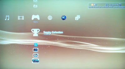
Yea, that’s what it’s really called. Look it up. It’s normally shortened to XMB, and for good reason. This is the main interface that you see every time you boot up the PS3. It’s meant to be a hub for all the activities you can perform on the PS3. Even after oodles of updates, navigating the rows and columns with the analog sticks feels awkward. The selection scrolls too quickly with even a slight nudge of the analog stick, making it difficult to make a precise choice. The XMB is also too touchy when differentiating between up/down scrolling and left/right scrolling.
Duplicate Entries
In the current iteration of the XMB, the PlayStation Store icon shows up in two separate columns. What’s worse is the icon and text are the same, but they behave differently.
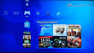
The store icon in the Game column shows a grid of currently hot items in the store.
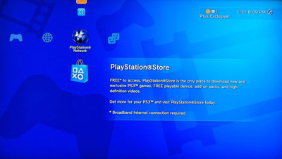
In contrast, the store icon located in the PlayStation Network column has a description of what the store has to offer. When the X button is pressed, these two store icons also behave differently.
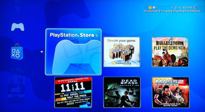
The Game column store icon enters the grid view, allowing the user to select from the highlighted items or press X again to enter the main store. The PlayStation Network column store icon enters the store when the X button is pressed.
I have been using the XMB for some time and never realized that there were two separate store icons until recently. I had always wondered why it sometimes had a grid of new items next to it and sometimes didn’t.
Disappearing Button Hints
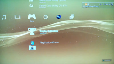
In some situations, icons in the XMB have further options that can be opened using the ▲ button. Sadly, the only way to know if an item has extra options to view is to catch the popup in the lower right corner before it disappears. The popup in the corner only sticks around for three seconds. The only way to get it back is to scroll away from the item you have selected and back.
The PlayStation Store
I don’t own a fucking PSP
That’s the title for a checkbox I’d like to see on the bottom of the main PlayStation Store screen.
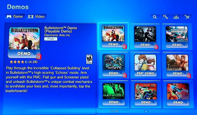
No matter where you go on the PlayStation Store, PSP content is laced in with PS3 content. Want to look at newly added demos? Sure, we’ll show you a chronological list of all the new demos that are available. We’ll just sprinkle demos for the PSP in with them. Not only that, but we’ll also let you download those demos even if you don’t have a PSP. Son of a bitch.
I want to try that demo
Okay, so you’ve sifted through all the PSP demos and found a demo you want to download. You press X on the download button and are taken to a screen that resembles a shopping cart page.
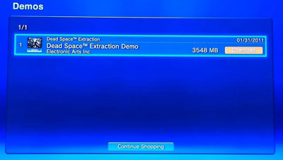
At first I thought the Continue Shopping button would allow me to queue up a bunch of downloads before executing them. In actuality, the Continue Shopping button just exits the download page, nothing is saved. The only way past this screen is to press X again while the download is selected. That was a completely necessary step.
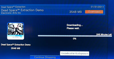
Next you’re presented with a transparent popup that shows a widely inaccurate download time and a single button labeled, “Download in Background.” Why would I want to stare at this progress bar instead of doing something else? Press X again.
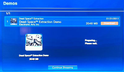
“Preparing… Please wait.” Suddenly the preparing popup goes away and you are taken back to the cart. The cart still contains your demo. Did your download get put in the background or did it fail? There was no notification that it succeeded. Clicking download again brings up the same transparent popup with a download bar. You click Download in Background again. You’re brought back to the shopping cart screen again. RAAAAGE!
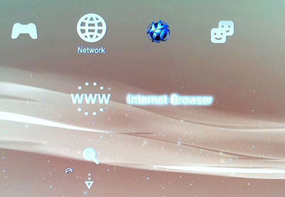
You exit the store to the XMB and scroll around looking for the active download. You finally see a strange swirly icon next to a triangle with two dots above it. That’s got to be active downloads, so obvious! Pressing X reveals both of your downloads.
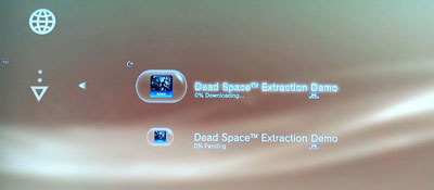
Wait, both of them? Dammit, apparently that first time you pressed Download in Background did actually succeed. You press X to try and find a way to cancel the download.
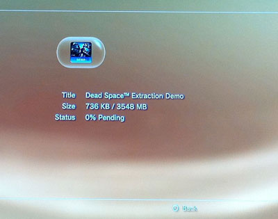
Your are brought to a screen containing the title, size, and status of the download. Approximately three more bytes of information than was on the previous screen. No further options except to go back with the O button. In a rage you scroll up and down a few times and finally, a small tooltip appears in lower right corner of the screen.
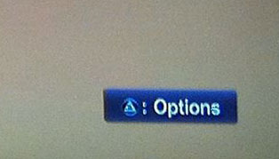
You press ▲ and an options screen appears.
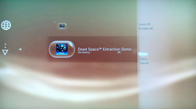
Once again your’e allowed to choose status, which brings you to the same screen as before. You click cancel, then confirm, and your bastard clone download is finally dead.
Uncompressing Downloads
Wahoo! Your download completed and you can play the demo now! You go back to the downloads section of the Network column on the XMB. The section is completely gone. Where the heck did it go? You scroll around and finally find it in the Game menu, still curiously inside a transparent capsule.
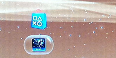
You press X to start your demo and are presented with this lovely screen.
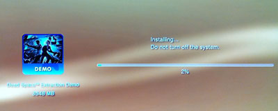
In the fetal position now, you wait 7 minutes and 17 seconds for the decompression to complete. You may now play your demo.
Trophies
I recently decided that I wanted to browse the trophies I had collected and also compare them with my friend to see what games we had in common. Trophies were added in the 2.40 update that was released on July 2nd, 2008.
Trophy Sync
I select the Trophy Collection icon from the Game column of the XMB. I’m presented with another progress bar.
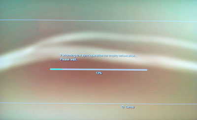
After waiting a few minutes my trophy information was finally available. Why this information isn’t synced and updated in the background I have no idea. Now that I had perused my trophy information I was ready to compare it to the trophies my friend had to see how we stacked up. Once I found his gamer card and clicked the trophy section.
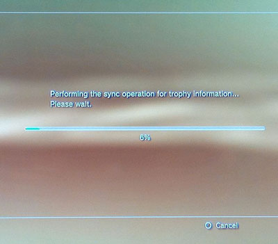
Screw it.
Conclusion
The PlayStation 3 has been receiving updates since November 2006. Updates to the XMB have been few and far between. As an example, the trophy UI was added in July 2008 and it didn’t receive the ability to sort by the date the trophy was awarded until April 2010! It’s almost as if the PS3 UI team gets shuffled around from project to project, barely getting to complete new features. This leads to awkward and unfinished interfaces that aren’t consistent or intelligent.
I’ve only scratched the surface of the PS3 UI and I haven’t even touched on the web browser or PlayStation Home. I have never used either for an extended period of time and I have a feeling the criticism would be so harsh I might actually receive death threats from those involved in their creation. Maybe another time.